A form is where a visitor stops reading and starts doing: registering for the conference, renewing a membership, applying for a grant, asking a question.
Every one of those visitors already decided to act. When they leave without submitting, the form talked them out of it.
This guide goes through the decisions that make the difference, in the order a visitor meets them. Every section has a working example you can type into. The examples run in your browser and send nothing, and every pattern here also runs on this site's own forms.
Why this is one guide now. It started as an eight-part series. We folded it into one page with live examples, because you learn more about a form by filling one in than by reading about it.
It's the first of our articles to get this treatment. We're going back through everything we've published to make it shorter, easier to scan and more hands-on.
Want to see the mistakes first? The broken versions has live forms that fail on purpose.
Every field needs a visible label
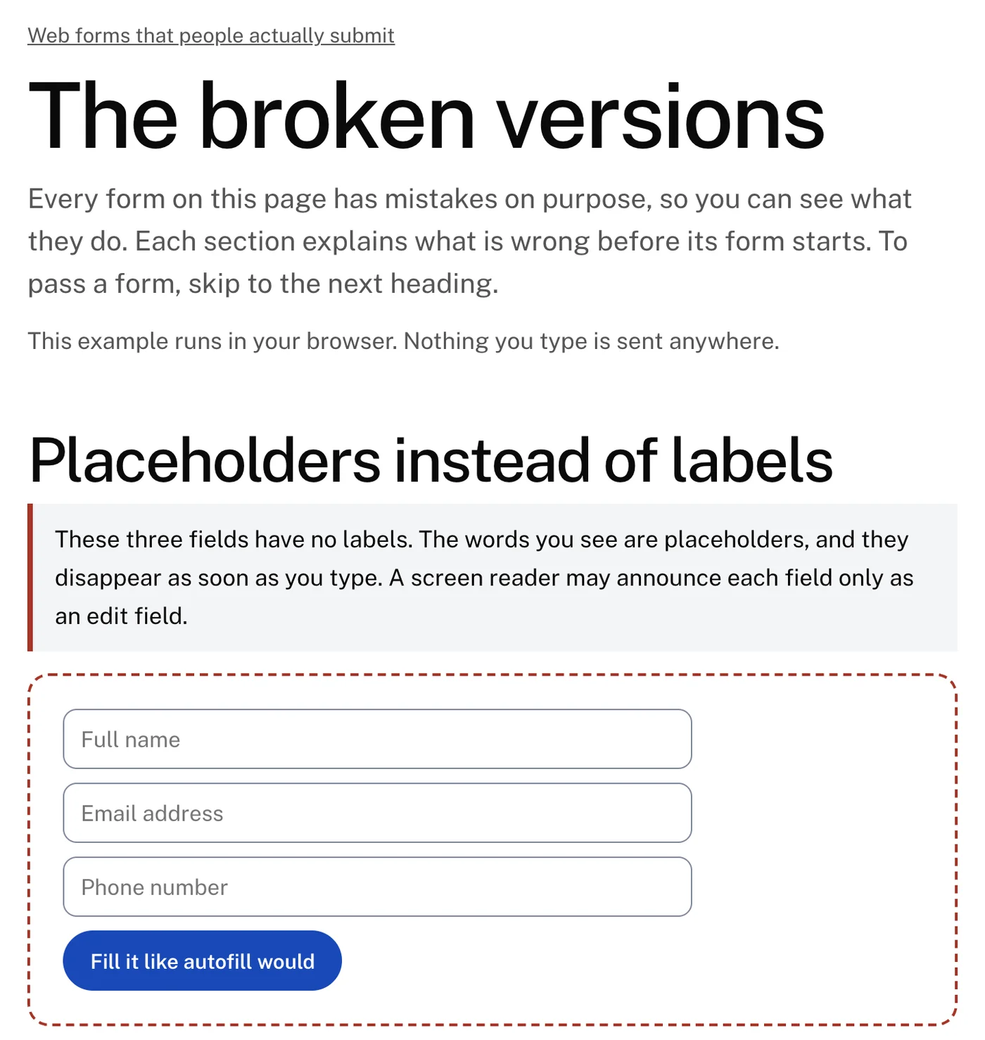
A label sits outside the field and stays there. A placeholder sits inside the field and disappears as soon as someone types.
Forms that use placeholders as labels look calm in a mockup, which is the only time anyone sees them empty. Once they're filled in, the questions are gone:
- A visitor checking their answers before submitting has nothing to check them against.
- Someone interrupted by a phone call comes back to boxes that no longer say what they are.
- Autofill fills every field at once, and checking becomes the visitor's whole job. Try it on the example below: the labels stay, so checking takes a glance.
Live example
Labeled fields, after autofill
This example runs in your browser. Nothing you type is sent anywhere. Try the broken version.
Placeholders still have a job: showing the format of an answer. The label asks "Phone number" and the placeholder shows (555) 012-3456. When the example disappears, the visitor no longer needs it.
For screen reader users, a label tied to its field in the markup is announced when the field gets focus. Support for announcing a placeholder varies, and it was never meant to be a field's name.
For public bodies and public institutions, a visible label is also a requirement of the accessibility standard they are held to, and procurement reviewers check for it.
Don't count on an automated checker to catch this one. The rules most tools run accept a placeholder as a field's name, so a placeholder-only form can pass the scan. We checked: the broken version of this form passes the same automated rules that fail its menu and its send button.
Floating labels, built carefully
A floating label starts inside the field, where a placeholder would be. It moves above the field when the visitor focuses it or types an answer.
It saves a line of height on a long form, and it can be done well. Done well means three things:
- It's a real label tied to the field, so it is announced like any other.
- It stays readable in both positions, at full contrast, never faded to placeholder gray.
- It moves out of the way before the visitor's text can collide with it.
Live example
A floating label that stays readable
This example runs in your browser. Nothing you type is sent anywhere.
Most floating labels decide whether to float by asking one question: is the field empty? The usual CSS trick checks whether the placeholder is showing.
That question gets the wrong answer the moment an input mask is involved.
When an input mask fills the field
An input mask formats an answer as it is typed: a phone number becomes (703) 555-0142, a date becomes 10/11/2026.
Masks help, until the mask characters are written into the field before anyone types. Then the field is never empty, and three things break:
- A floating label sees (___) ___-____, decides there is an answer, and jumps up on page load or sits on top of the mask.
- The form's own validation sees text and may let a blank phone number through.
- A screen reader reads the underscores aloud.
Live example
A phone mask that knows when the field is empty
This example runs in your browser. Nothing you type is sent anywhere. Try the broken version.
How to build a mask that works:
- Count digits, not characters. The field is empty until it holds a digit. Punctuation the mask added is never an answer.
- Show the template only while the field is focused, behind the visitor's text and outside the value. The label floats first, so nothing overlaps.
- Accept any format. Someone pastes 703.555.0142 or types it with spaces. Keep the digits and format them yourself.
- Keep the caret where the visitor put it. A mask that jumps the cursor to the end makes every correction a retype.
- Let international numbers through. A leading + should turn the US mask off. A strict mask is the reason people overseas can't register.
- Store the digits, not the formatted text. The record should hold 7035550142, so search, deduplication and the next system all agree on what the number is.
Ask for the right keyboard
On a phone, the field's type decides which keyboard appears:
- An email field puts @ on the first screen.
- A phone field brings up a number pad.
- A generic text field gives the visitor the full keyboard for everything, and they dig through symbol screens to type an address.
Live example
The right keyboard for each field
This example runs in your browser. Nothing you type is sent anywhere.
Show the code Hide the code HTML, 4 lines
<input type="email" autocomplete="email" autocapitalize="off" spellcheck="false">
<input type="tel" autocomplete="tel">
<input inputmode="numeric" autocomplete="postal-code">
<input inputmode="decimal">
The same attributes feed autofill. When fields say what they hold (name, email, organization, postal code), the browser offers to fill them in, and the slowest part of a mobile form becomes one tap.
Phone keyboards also capitalize the first letter and correct words they don't know. That helps in a message box. In an email address or a reference number it quietly changes the answer, so turn autocapitalization and autocorrect off for fields that hold identifiers.
Size matters as much as the keyboard:
- Make tap targets at least 44 pixels tall.
- Connect each checkbox's label, so the words are tappable too.
- Keep field text at 16 pixels or larger. Below that, iPhones zoom into the field and leave the page zoomed after the visitor finishes typing.
Errors that say how to fix the answer
When a check fails, the form knows which field failed and which rule was broken. "Invalid input" throws that knowledge away.
A useful message names the field, says what is wrong and shows a correct answer: "Enter a 10-digit US phone number with its area code, like 555-012-3456."
Timing matters too. A form that checks on every keystroke calls an email address invalid the whole time it is being typed. Check when the visitor leaves a field, since that is when the answer should be finished.
Once a field is marked wrong, check it as they type, so the message disappears the moment the answer is fixed. Then:
- Put each message next to its field, where the visitor is already looking.
- On submit, list every problem at the top with a link to each field, and move focus to that list.
- Never rely on color alone. A red border is invisible to some color-blind visitors and to every screen reader. Words, an icon and a thicker border carry the message.
- Tie the message to the field in the markup, so it is announced when the field gets focus.
- Never clear a field because of an error elsewhere. A typo in the phone number is not a reason to empty the message box.
Live example
Errors that say how to fix the answer
This example runs in your browser. Nothing you type is sent anywhere. Try the broken version.
Catch email typos without blocking anyone
Someone types gamil.com instead of gmail.com. The address is correctly formed, so every validator accepts it.
Your reply, receipt or registration confirmation goes nowhere. From the visitor's side, they wrote to you and you never answered.
A few percent of hand-typed addresses contain a typo, and the common ones are predictable. When the visitor leaves the field:
- Check the address against a short list of well-known misspellings.
- Explain the suggestion and offer a one-tap fix.
- Let the visitor keep what they typed. Unusual addresses are real, and the visitor always gets the last word.
Live example
An email check that asks instead of blocking
This example runs in your browser. Nothing you type is sent anywhere.
Split long forms into steps
A grant application or an event registration can run to thirty questions. On one page, the scroll bar tells the visitor how much work is left before they start.
Split into steps, the same form asks for a few minutes at a time. What makes steps work:
- One topic per step.
- A progress indicator that tells the truth: "Step 2 of 3", never a bar that jumps from 20 to 90 percent.
- Check each step before moving on, so problems surface while the questions are fresh.
- Back never loses anything. A visitor who goes back to fix a date finds every later answer where they left it.
- End with a review screen that shows every answer with a way to edit it, before the final submit.
- Move focus to the new step's heading, so screen reader users hear where they are.
- Enter moves one step forward. It should never submit a half-finished form.
Live example
A three-step form that keeps your answers
- About you
- Your event
- Anything else
- Review
Request received
That was the last step. In a real form, this is where the request is saved and staff are notified. This example sent nothing and has cleared what it saved.
Fill in a step, then reload the page. Your answers come back, and only this browser ever had them.
This example runs in your browser. Nothing you type is sent anywhere. Try the broken version.
Save answers so people can come back
People rarely finish a long form in one sitting. They need a budget figure from finance, a reference letter, a colleague's sign-off. A form that forgets everything when the tab closes makes them start over, and many won't.
There are two ways to save answers. Whichever you use, tell people: "Saved on this device" next to the form is enough.
For a short or anonymous form, keep the answers in the visitor's own browser as they type, the way the multi-step example above does. Reload this page and your answers come back.
- Nothing leaves the device, and nothing needs an account.
- A "Clear my answers" button lets someone on a shared computer remove them.
- Never keep passwords, payment details or anything sensitive in the browser.
For a long application, save drafts on the server and email the visitor a link to resume. Guard that link:
- Send it only to the address entered in the form.
- Make it expire.
- Limit how many one visitor can request. Otherwise the resume box becomes a way to send your email to strangers.
Dark backgrounds: tell the browser
Your CSS styles the box, the border and the text of a field. The browser and operating system draw the rest: the arrow on a menu, the list that opens below it, the calendar of a date field, the check in a checkbox.
They assume a light page unless you say otherwise. On a dark footer with a newsletter signup, that can mean a dark gray arrow on a near-black menu, which reads as a plain rectangle.
One CSS declaration fixes it. Set color-scheme to dark on the dark area, and the browser redraws its parts of every control to match.
Live example
Native controls on a dark background
This example runs in your browser. Nothing you type is sent anywhere. Try the broken version.
Show the code Hide the code CSS, 4 lines
.site-footer {
  background: #11141a;
  color-scheme: dark;
}
Then check what color-scheme doesn't cover, ideally on an operating system your team doesn't use, in its light and dark modes:
- Autofill paints filled fields pale yellow or pale blue, which makes white text unreadable.
- Placeholder gray is chosen for white backgrounds.
- A focus ring that was obvious on white may vanish on black.
Stop spam without a puzzle
A CAPTCHA turns your spam problem into the visitor's chore. It is hardest on people with low vision, slow hands or a screen reader.
Most form spam is automated and careless, so three checks the visitor never sees stop nearly all of it:
- A honeypot: one extra field hidden from people and screen readers. Bots fill in every field, so a filled honeypot marks the submission as spam.
- A timer: nobody answers a contact form two seconds after the page loads.
- A rate limit: thirty submissions a minute from one address are not thirty people.
Live example
The field only bots fill in
This example runs in your browser. Nothing you type is sent anywhere.
What gets past those checks was typed by a person. Flag it for review instead of blocking it, so a false positive never loses a real message.
Show every sender the same confirmation, so a bot's operator learns nothing from the response.
Try the broken versions
Reading about a placeholder that disappears is not the same as filling in a form and losing track of it.
The broken versions page has live forms with the mistakes this guide warns about. Each one is explained before it starts, and each links back to the fixed version here.
Why it's a separate page. We hold every page on LFW.com to a perfect score in automated accessibility checks, and the site is scanned every night. Forms that fail on purpose would break that rule on the guide itself.
So the failures live on one page, and each is excused precisely: one rule, on one element, on that one page. Anything else that fails there still raises an alarm, and the page keeps its real, lower score. It is also kept out of search results.
If you would like to know how your own forms do, the free audit checks your homepage's fields for labels, contrast and the other automated accessibility rules.
We also build and fix forms for organizations on WordPress. Talk to us about your forms.
 Leland Fiegel