The improvements we make to LFW.com, from clearer page layouts to new ways of getting things
done. This is the same ongoing attention we bring to the websites we manage.
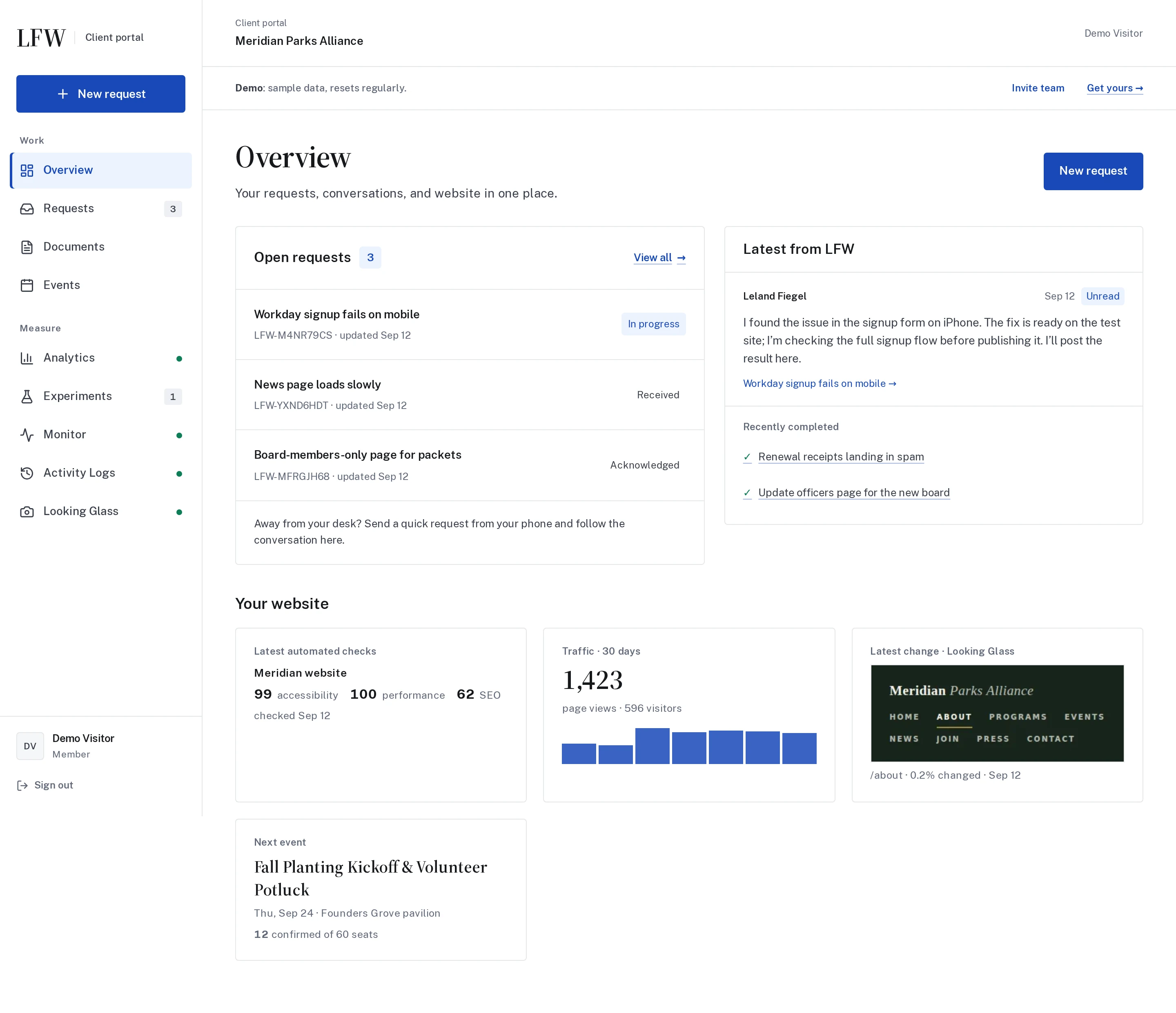
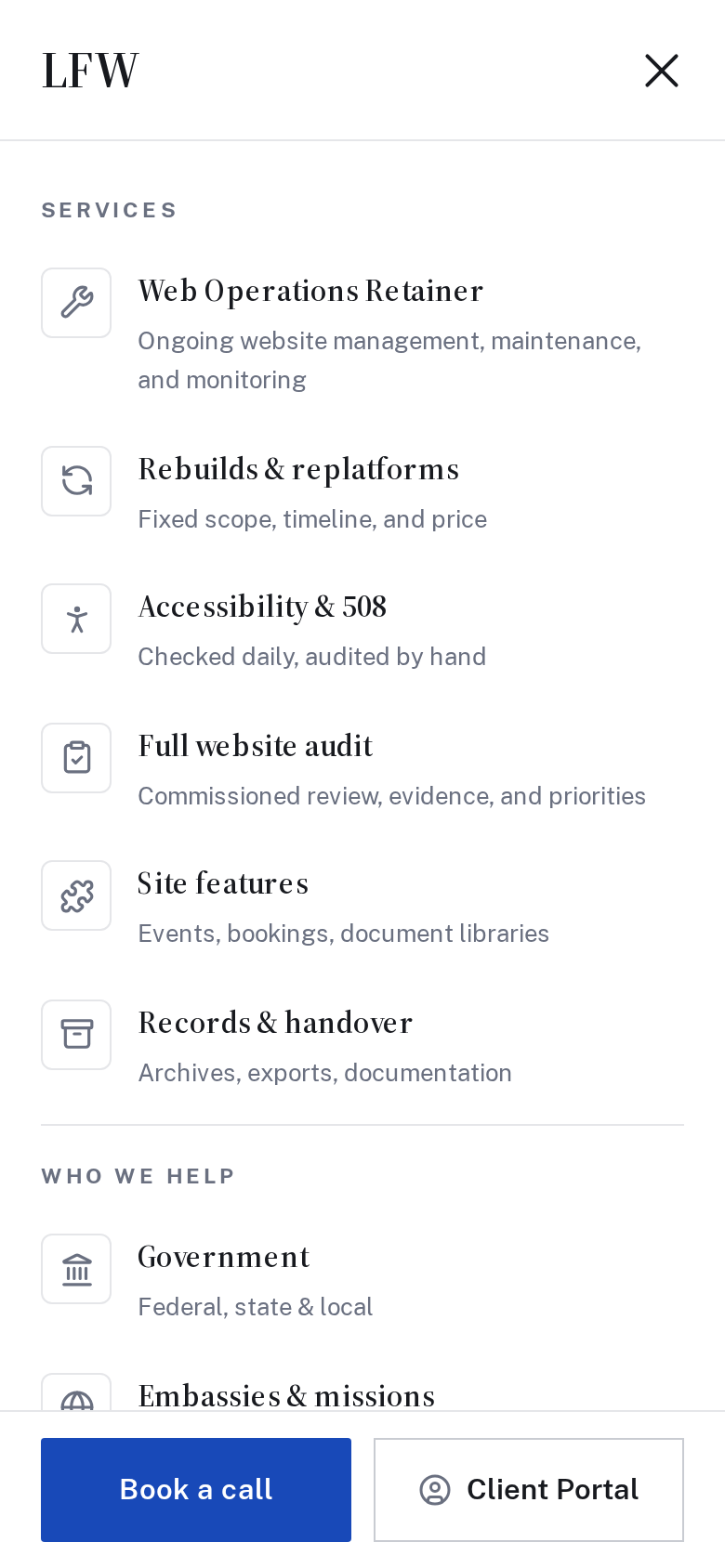
The Client Portal now uses a consistent navigation layout across requests, analytics, experiments, and connected services. Refreshed product screenshots show the interface you can explore in the tour.
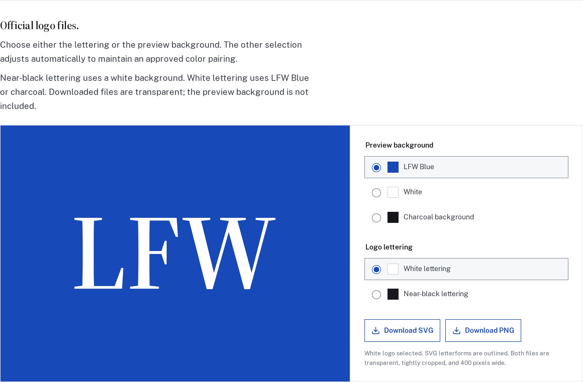
The brand page now includes an interactive logo download tool. Choose white or near-black lettering and preview it on an approved background. The paired choice adjusts automatically; downloaded SVG and PNG files stay transparent and tightly cropped.
We also clarified the supporting palette, including separate positive and error colors and how to pair them with readable labels.
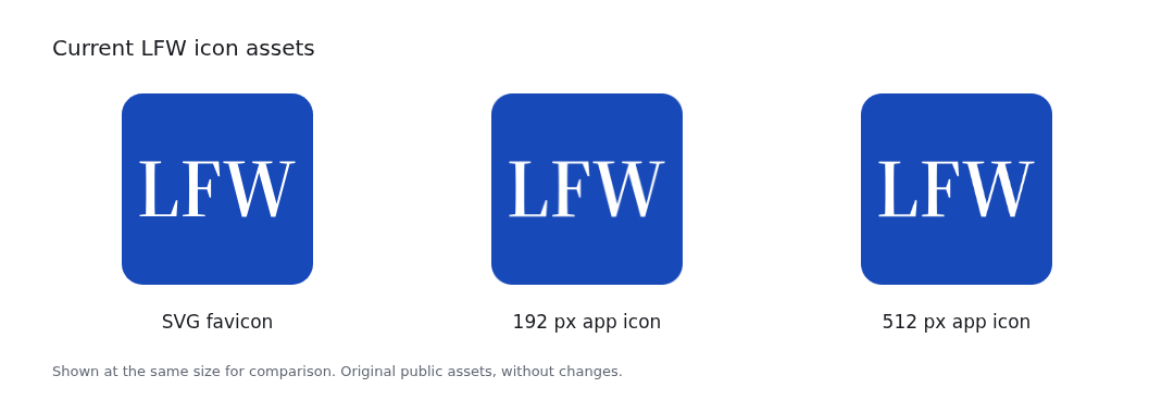
LFW’s browser and home-screen icons now use the same white lettering on LFW Blue. The small details follow the wordmark’s proportions and spacing, so the site stays recognizable in a tab or among your shortcuts.
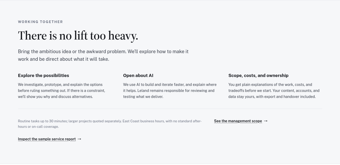
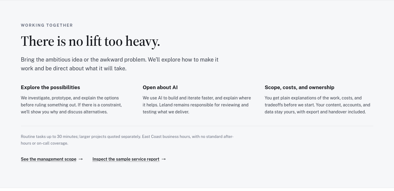
Related links on the About and service report pages now sit together in a clear action row. You can move from the explanation to the scope or sample report without hunting for a stray link.
The About page’s next steps before and after they were grouped together. Matched previews reconstructed from the original source.
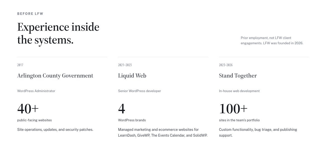
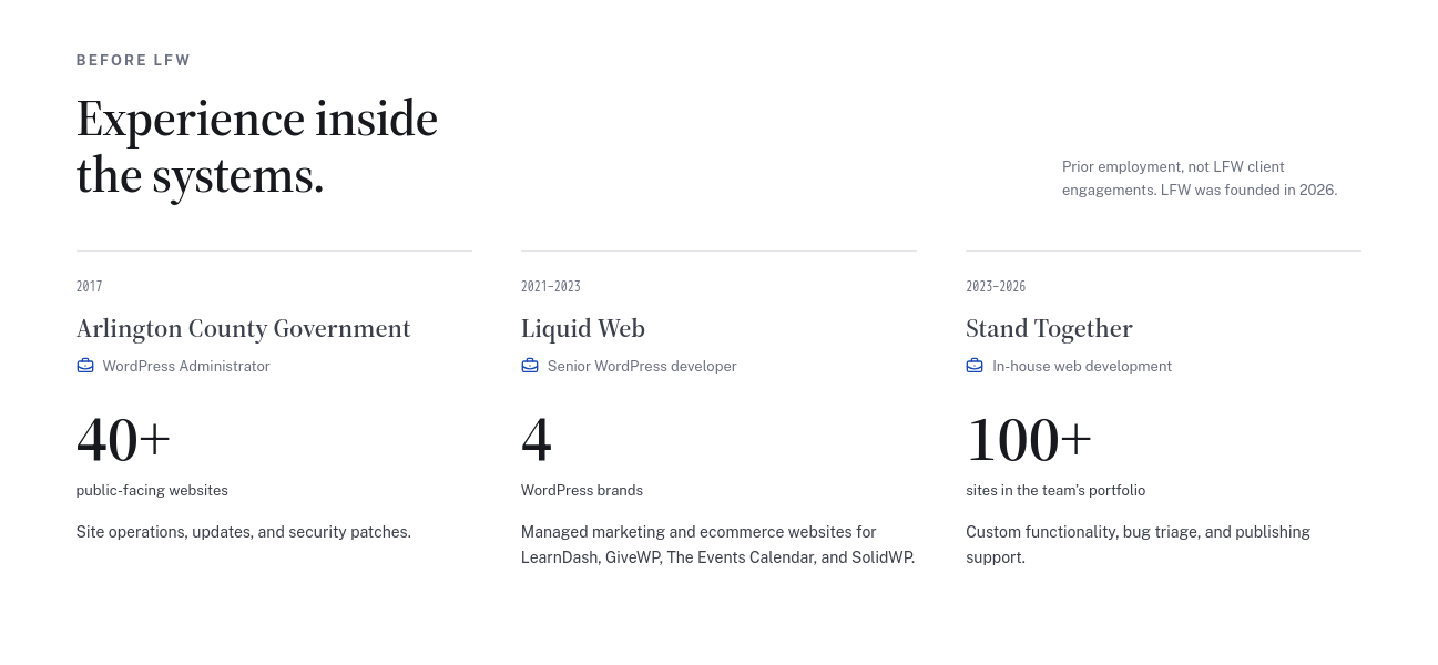
Leland’s prior roles now have a more deliberate hierarchy: dates, organizations, job titles, and the scale of the work. Small role icons and closer spacing make the relationship between those details easier to follow.
The section continues to distinguish prior employment from LFW client engagements.
The prior-experience cards before and after tighter spacing and role icons. Matched previews reconstructed from the original source.
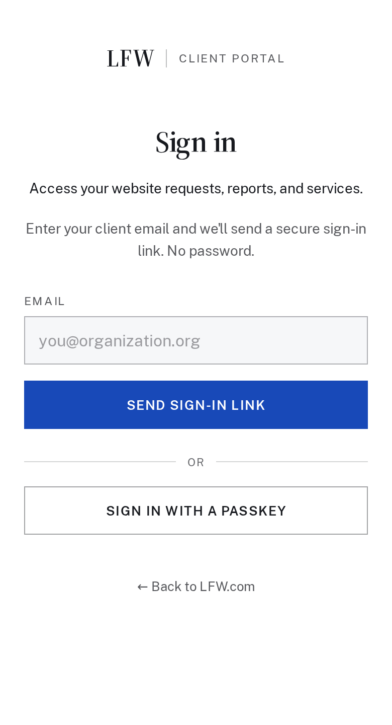
The Client Portal sign-in is centered on phones, with less repeated labeling. Clearer destination names and directions help visitors who arrive at the wrong sign-in page find their way.
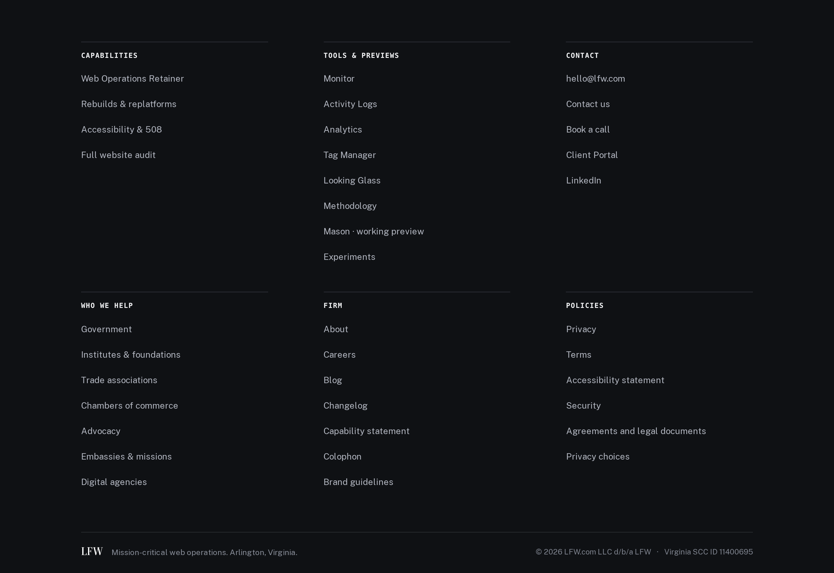
The footer’s second set of navigation groups now starts on a shared row on desktop. Related destinations are easier to scan, and the final divider follows the same content edges.
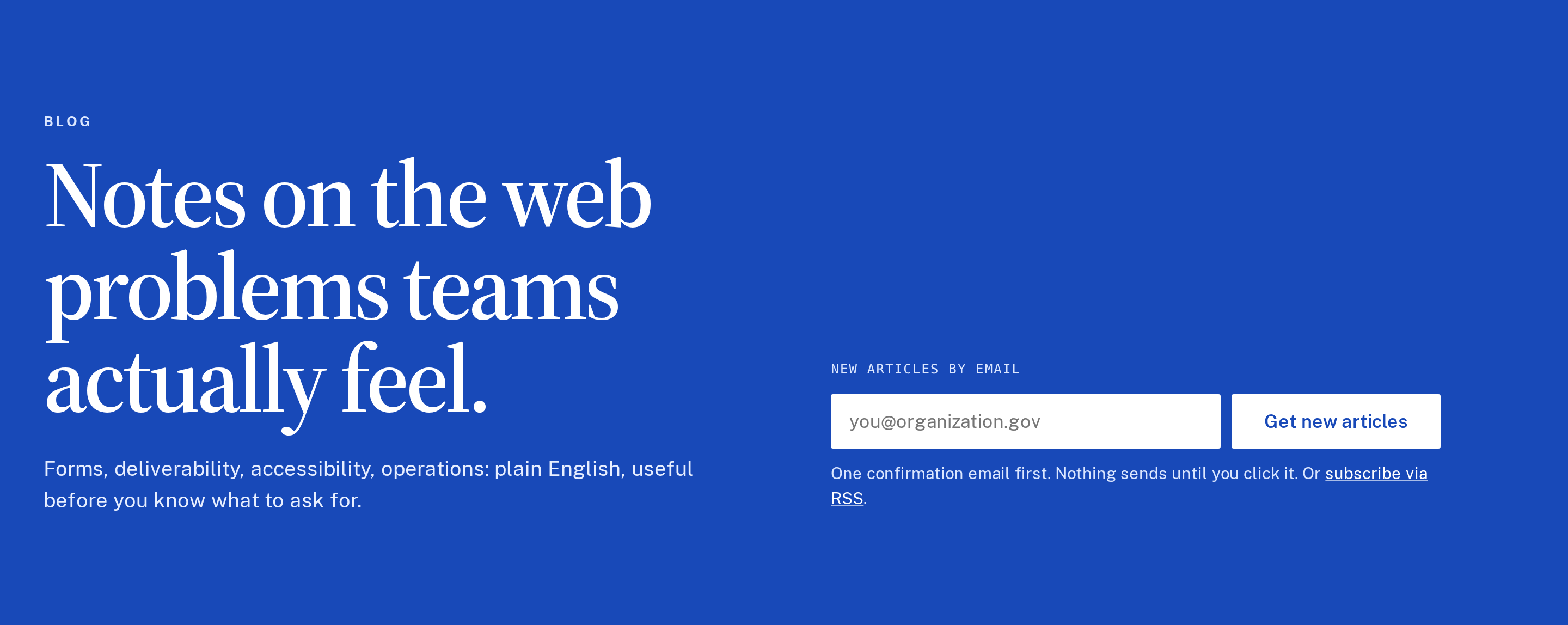
The blog index gives article titles, descriptions, and topic filters a clearer layout across screen sizes. You can scan the collection on a wide screen or work through it comfortably on a phone.
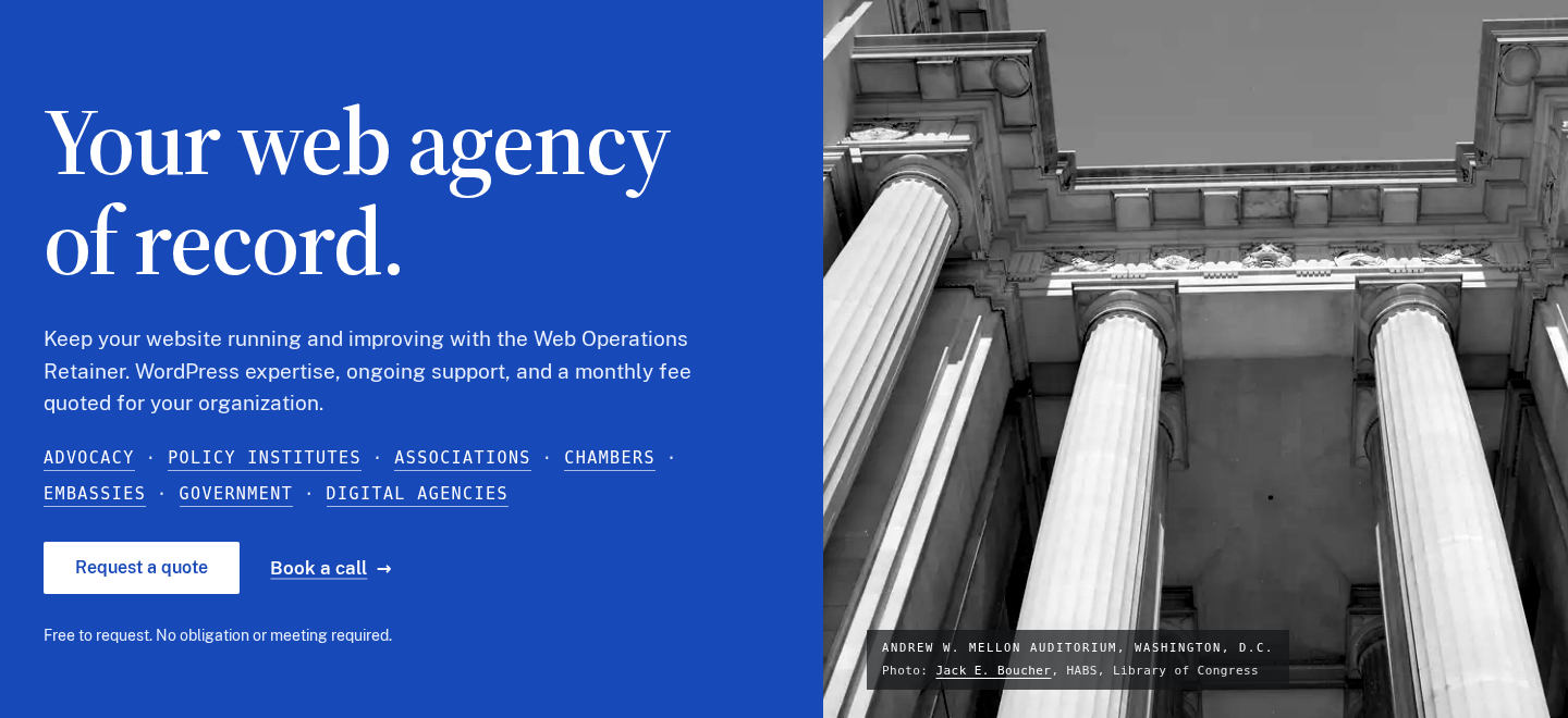
The public site now uses the LFW blue header and gives the homepage more room on a wide screen. Type and spacing were adjusted together so the opening message reads clearly across screen sizes.
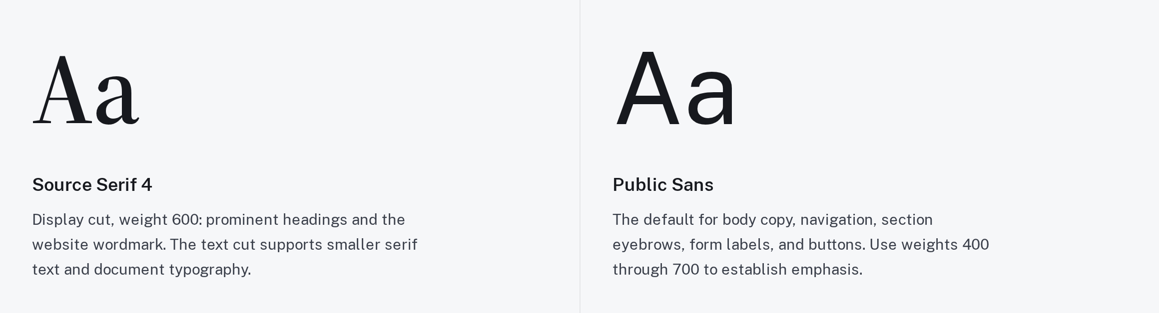
The brand page brings the LFW colors, type, and logo guidance into one place. The examples show how the identity should work across a website and its supporting materials.
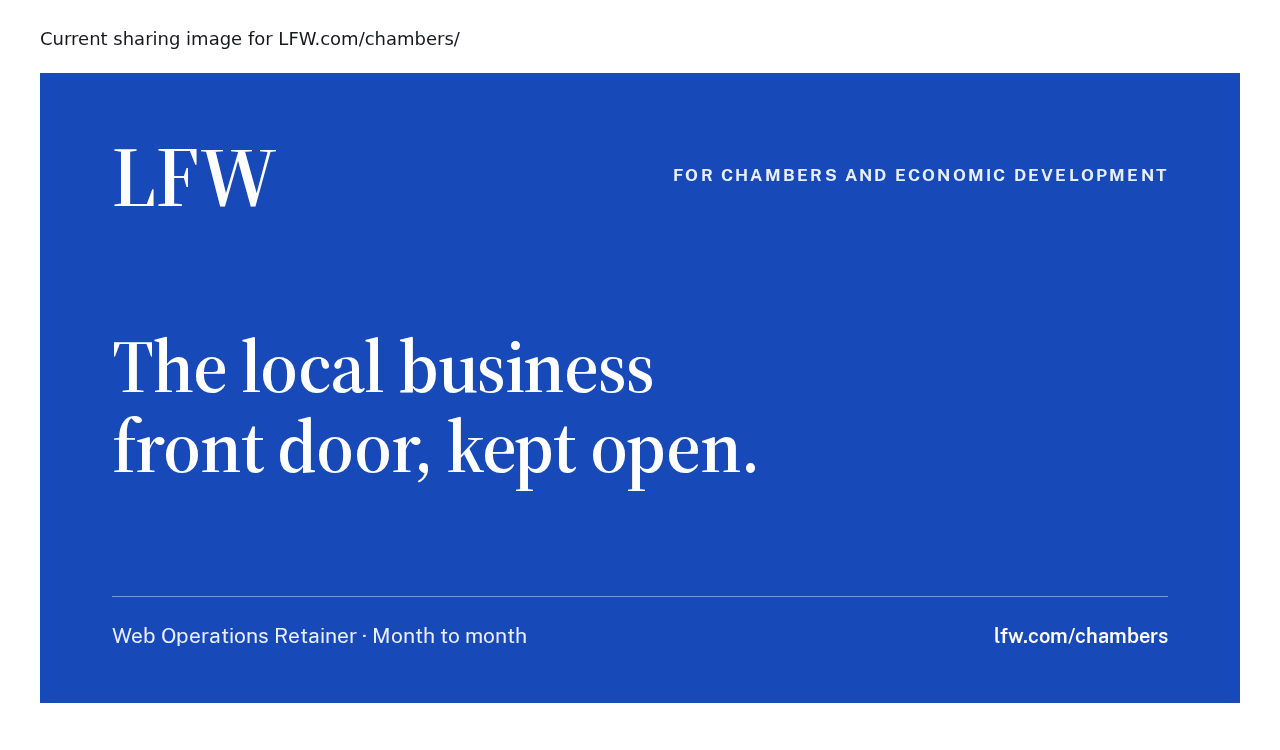
Shared links have previews that identify the page they lead to. Service and audience pages carry their own title, making a link easier to recognize in a message or social feed.
You’ve reached the first update in this collection.
Selected public improvements to LFW.com. Client work and confidential operational details
stay private. Earlier entries were collected from the project’s history and dated to the
relevant milestones. Screenshots labeled “current” show the version captured for this
changelog, not necessarily the version on the entry’s date.
What could we improve on your site?
Bring the website you have and the things you’d like to change. We’ll talk through the
priorities and prepare a quote for your organization.