LFW

Changelog

See what’s changed.

The improvements we make to LFW.com, from clearer page layouts to new ways of getting things done. This is the same ongoing attention we bring to the websites we manage.

69 updates Aug 10, 2026 to Sep 13, 2026

Jump to the first update

A website keeps getting better
when someone keeps working on it.

Subscribe via RSS

Design updates

Showing 1–12 of 24 updates

September 2026

23 updates
Design

One topic at a time.

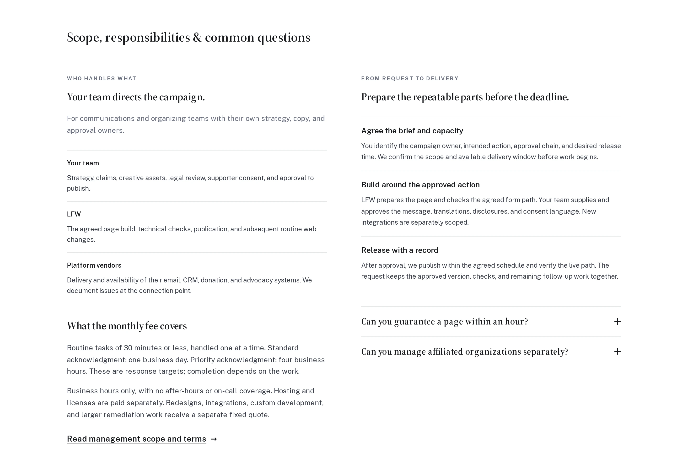
Our audience pages now move through responsibilities, delivery, fees, and questions in a clear sequence. Related items sit together, instead of unrelated sections competing in uneven columns.

On phones, the same sequence reads straight down the page. Paragraphs keep a comfortable width, and the shared improvement carries through the English, Spanish, and French pages.

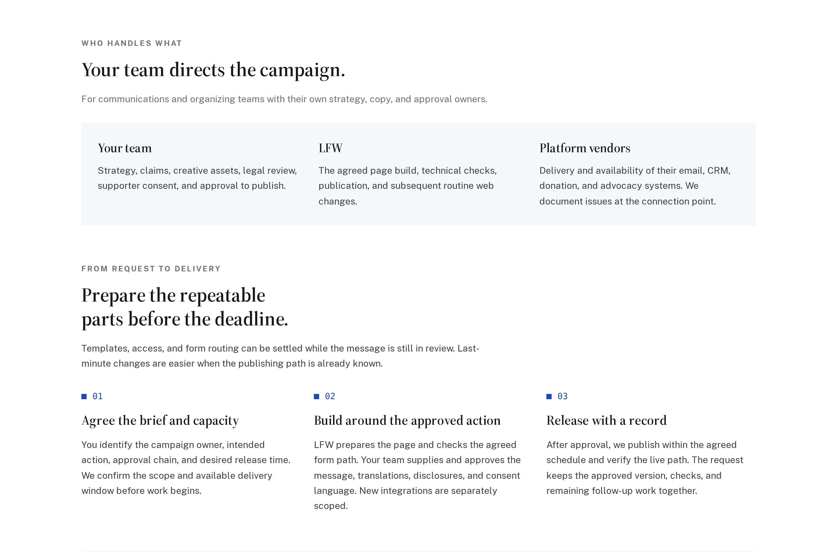
The opening responsibilities and delivery sections on the advocacy page, at the same desktop size. The before image is from the live original; the after image is from the updated source preview. In the new layout, fees and FAQs follow below the cropped view.

The advocacy page puts responsibilities and fees in one column, with delivery steps and questions at different heights in another.

Enlarge to view the full screenshot.

Unrelated sections compete in two columns.
Responsibilities form one complete section, followed by a separate delivery section with three related steps.

Enlarge to view the full screenshot.

A clear sequence, with comparable items grouped together.
Explore the advocacy page
Design

Product previews that fit your phone.

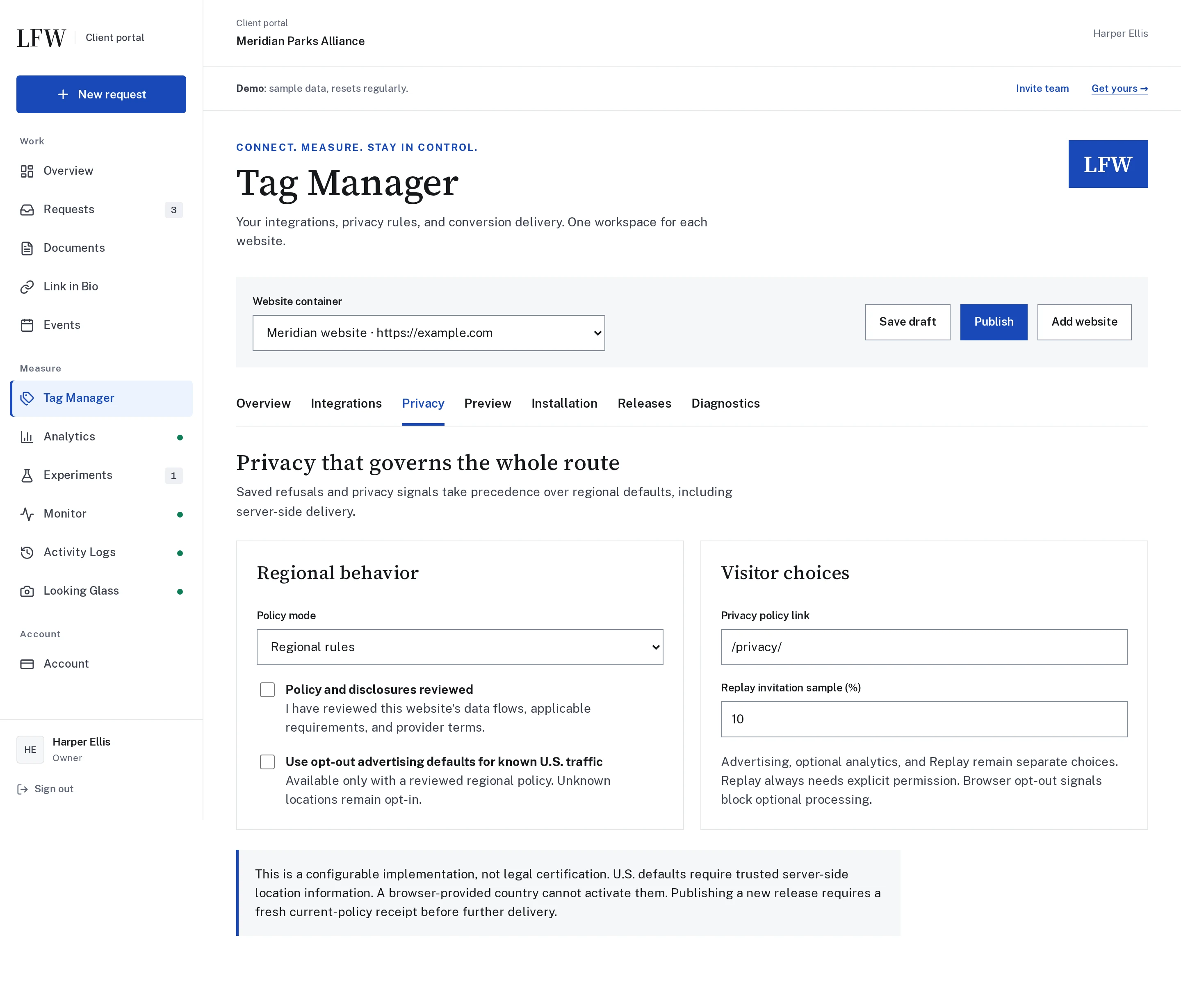
Explore Tag Manager through real phone and desktop views of the Client Portal and WordPress connection. On a phone, the previews now show the mobile interface first.

Switch between Phone and Desktop or enlarge a screenshot to inspect the full view. Short previews no longer leave a tall empty space below the image.

Client Portal privacy controls Enlarge screenshot
The Client Portal Tag Manager privacy settings, with a visible fictional-demo notice and phone and desktop views.

Enlarge to view the full screenshot.

Actual Client Portal demonstration with fictional data. No advertising account is connected.
Explore Tag Manager
Design

A solid blue header, again.

We tried a translucent header. Leland preferred the solid blue, especially over blue sections, so we brought it back.

The header still follows you as you scroll. Only the background treatment has changed.

The matched previews from our original header experiment, shown in reverse to illustrate the return to solid blue. These are the earlier style comparisons, not new page captures.

The translucent blue header lets some of the homepage photograph show through.

Enlarge to view the full screenshot.

The translucent treatment we tried.
The solid LFW Blue header keeps its color above the same photograph.

Enlarge to view the full screenshot.

Back to solid LFW Blue.
See the original experiment
Design

Just a little bit of polish.

We tried a touch of translucency in the blue header, letting the page show through while the lettering and buttons stayed solid.

Update: we later returned to solid LFW Blue. Leland preferred how it looked over blue sections.

The same public page and scroll position, with the original solid background and the new translucent one. Reconstructed from the two header styles.

The solid blue LFW header above the homepage photograph.

Enlarge to view the full screenshot.

The original solid blue background.
The same header with a little of the photograph showing through its blue background, while the navigation stays opaque.

Enlarge to view the full screenshot.

A little of the page shows through.
Read the follow-up: back to solid blue
Design

Fewer lines, clearer sections.

Removed redundant closing lines beneath the questions on our audience pages and in the brand color guide. Dividers still separate questions and sections, without extra rules across empty space.

The shared audience-page improvement also applies to the Spanish and French versions. The questions, answers, and expandable details are unchanged.

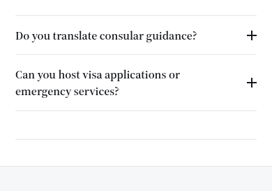
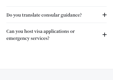
The embassies page captured on a phone-sized viewport, then the same view with the exact updated styles applied in a browser preview before deployment.

The last two embassy questions followed by three gray closing lines with empty space between them.

Enlarge to view the full screenshot.

Several closing lines at one section ending.
The same embassy questions retain their separator and lead into the next section with one boundary line.

Enlarge to view the full screenshot.

One section boundary, with useful question separators retained.
Explore the embassies page
Design

The same small details, everywhere.

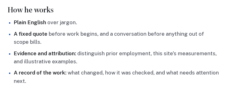
Ordinary lists now use LFW Blue square bullets throughout the public website, including Leland’s biography and the sample service report. Longer items keep their natural line breaks and spacing.

Numbered lists, navigation, and purpose-built icon lists keep their own treatment. Markers on dark backgrounds use a lighter color so they remain easy to see.

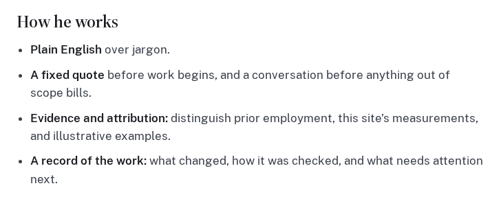
The biography list captured from the live page, followed by the same view with the exact updated styles applied in an isolated browser preview. The text and layout are unchanged.

The How he works list uses ordinary round bullets in the body-text color.

Enlarge to view the full screenshot.

The browser’s default round bullets.
The same How he works list uses small LFW Blue square bullets with unchanged text and line breaks.

Enlarge to view the full screenshot.

The shared LFW Blue square treatment.
Meet Leland
Design

A clearer place for each tool.

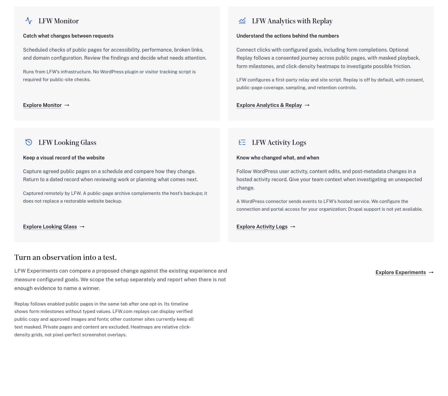
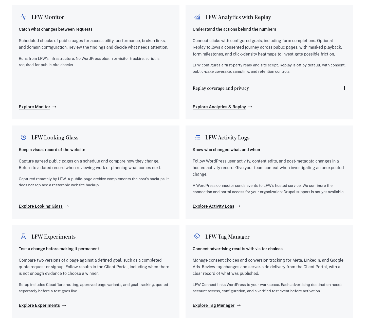
Experiments now sits alongside the other retainer tools, with Tag Manager completing the group. Compare what each service helps you do, how it connects, and what setup is needed.

The six descriptions share one grid on desktop and stack on a phone. Replay’s extra coverage and privacy details open inside its own card, where they belong.

The tools section before and after, reconstructed from the actual components at the same desktop width. These are isolated component previews, not archived production screenshots.

Four retainer tool cards followed by a separate Experiments row and detached Replay notes.

Enlarge to view the full screenshot.

Experiments sat outside the tool grid.
Six consistently arranged tool cards, with Experiments and Tag Manager together in the final row and Replay details inside Analytics.

Enlarge to view the full screenshot.

One consistent grid, with useful setup details for every tool.
Explore the tools and add-ons
Design

Follow the first month, step by step.

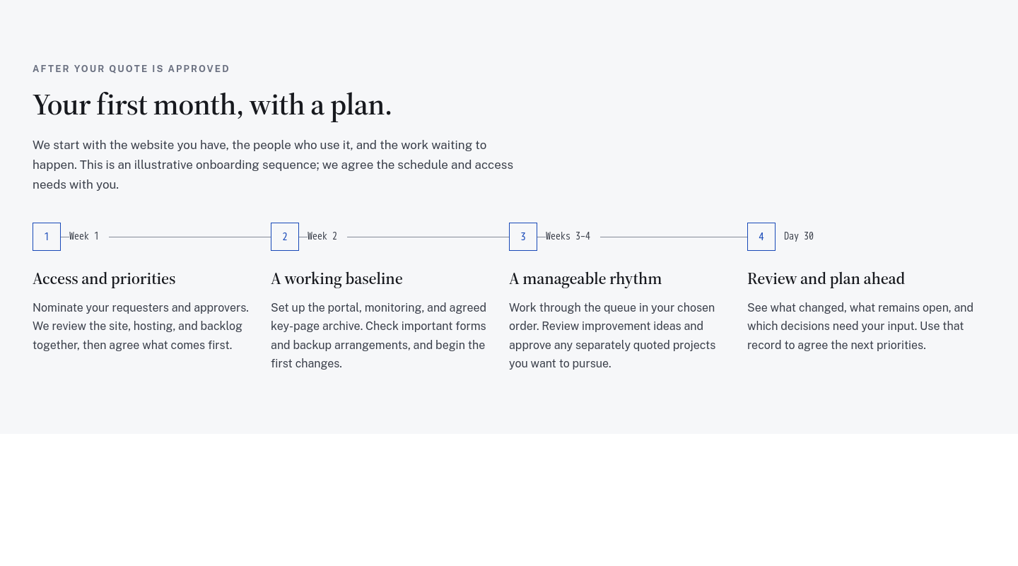
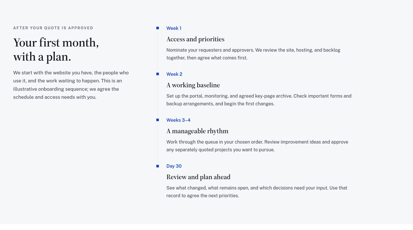
The retainer’s onboarding guide now uses a simple vertical timeline, with blue markers, clear week labels, and room to read each step. The sequence is easier to follow on desktop and mobile.

It uses the same visual approach as our changelog. The plan still covers access, a working baseline, the request queue, and a first-month review, with the actual schedule agreed before work begins.

The same four onboarding steps in matched desktop previews, reconstructed from the original and updated components. The copy is unchanged.

The first-month guide spreads four steps across a horizontal connector beside small week labels.

Enlarge to view the full screenshot.

Four steps stretched across a horizontal rail.
The first-month introduction sits beside a vertical timeline with blue square markers and readable steps for week one, week two, weeks three and four, and day thirty.

Enlarge to view the full screenshot.

A clear sequence with the connector beside the content.
See your first month
Design

Color labels that fit on a phone.

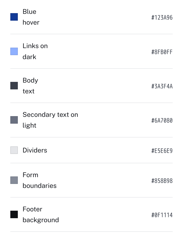
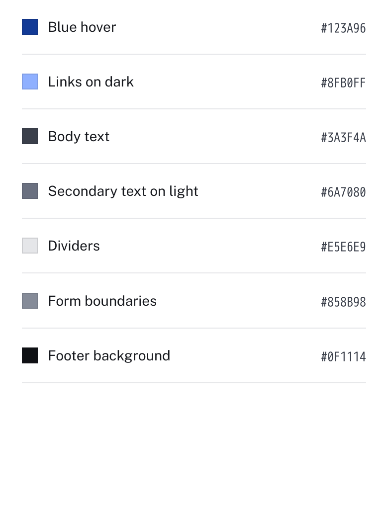
The supporting palette on our brand page now gives color names the space they need. Short labels stay on one line, with a consistent gap before their color codes.

The type stays the same size. Longer labels can still wrap when they need to, including when you enlarge the text.

The same palette component at a 390-pixel phone width. Captured from the original before-and-after source in isolated previews.

Before: short color names such as Blue hover and Body text wrap onto two lines, leaving space before the color codes.

Enlarge to view the full screenshot.

Short labels wrapped early despite the available room.
After: color names use the available width and color codes stay aligned on the right, with a consistent gap between them.

Enlarge to view the full screenshot.

The same type size, with more room for each label.
Explore the brand guidelines
Design

An easier read, from top to bottom.

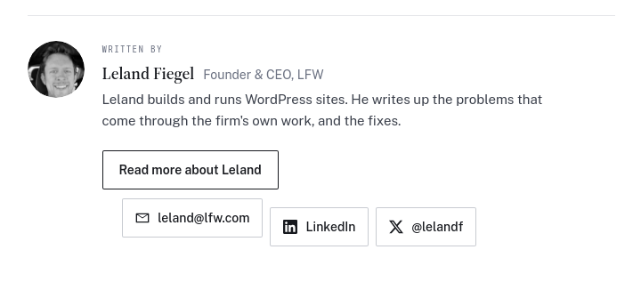
Blog articles have a simpler opening and tidier author links. On desktop, the reading sidebar sits below the fixed header. A white progress bar is easier to see against the blue navigation.

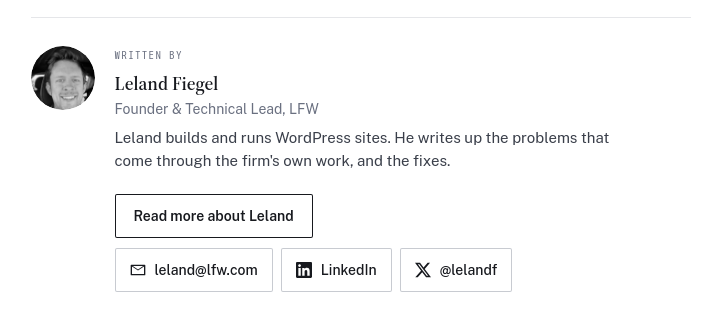
The author card before and after its contact links were aligned and the professional title updated. Matched previews reconstructed from the original source, not saved historical production screenshots.

The old article author card with contact buttons stepping down onto different baselines.

Enlarge to view the full screenshot.

The original stepped contact buttons.
The article author card with aligned contact buttons and the title Founder and Technical Lead.

Enlarge to view the full screenshot.

Aligned links and the current professional title.
Read an article
Design

A familiar way to open the details.

Questions and expandable explanations now share the same plus-and-minus controls across the public site. Lists inside them use our blue square bullets, too.

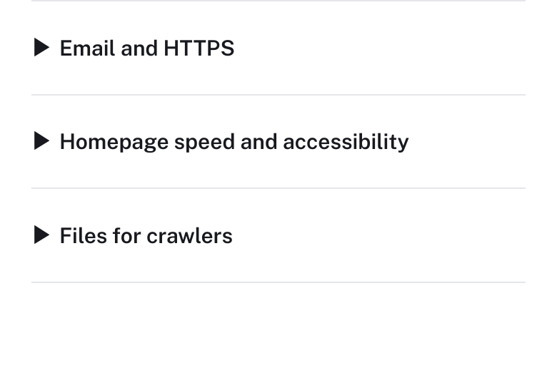
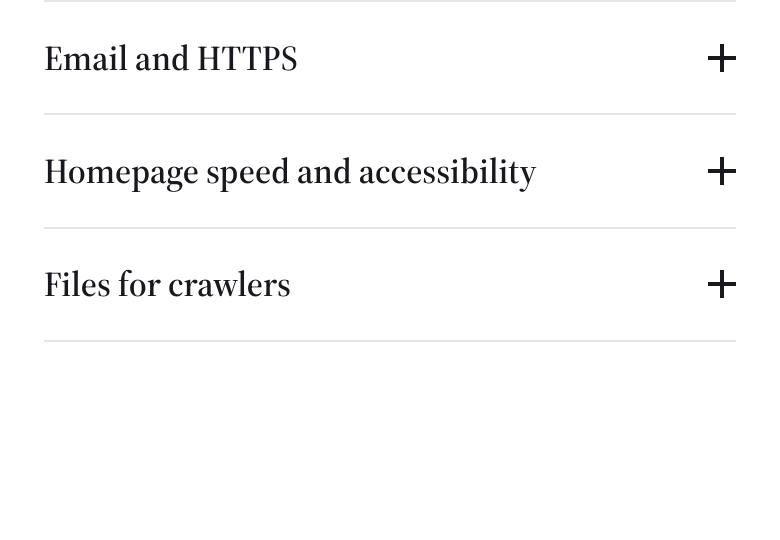
The audit page’s closed questions at the same phone width, captured from the original components in isolated previews.

Before: the audit questions use native disclosure triangles on the left of each question.

Enlarge to view the full screenshot.

A different disclosure style on the audit page.
After: the same audit questions use right-aligned plus controls and the shared heading style.

Enlarge to view the full screenshot.

The same questions, using our shared FAQ component.
Explore the free audit
Design

See how the work fits together.

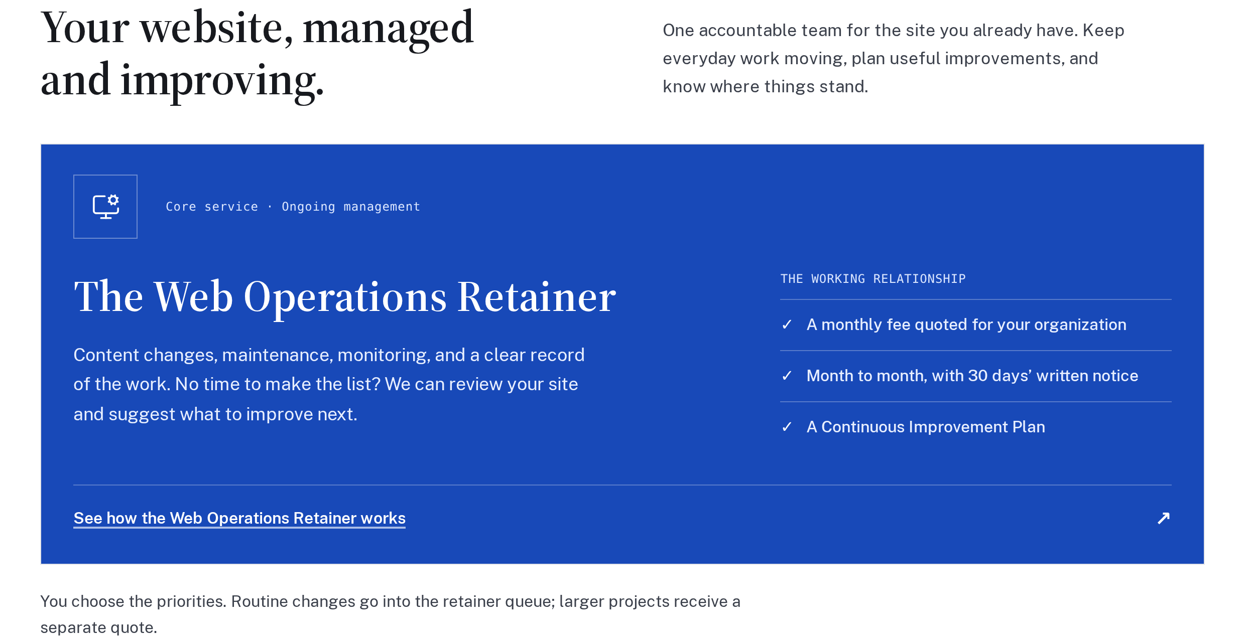
The homepage now leads with the Web Operations Retainer, followed by the working Client Portal and sample service report. You can explore how requests, completed work, and the next decisions fit together before asking for a quote.

The homepage’s main service Enlarge screenshot
The blue Web Operations Retainer card on the homepage, with its scope, monthly arrangement, and Continuous Improvement Plan.

Enlarge to view the full screenshot.

Current view of the homepage’s main service section.
Explore the homepage

Keep exploring

Showing 1–12 of 24 updates

Load older updates

Selected public improvements to LFW.com. Client work and confidential operational details stay private. Earlier entries were collected from the project’s history and dated to the relevant milestones. Screenshots labeled “current” show the version captured for this changelog, not necessarily the version on the entry’s date.

What could we improve on your site?

Bring the website you have and the things you’d like to change. We’ll talk through the priorities and prepare a quote for your organization.
Prefer to write?

Tell us what needs to work better.

Slow, fragile, hard to edit, missing a workflow. Say it plainly, and you'll get a straight answer, not a ticket number.