The improvements we make to LFW.com, from clearer page layouts to new ways of getting things
done. This is the same ongoing attention we bring to the websites we manage.
Monitor checks LFW.com's discovered public pages for performance, including blog articles, alongside accessibility. A new image-size check flags heavy images and responsive variants.
Desktop and mobile performance checks cover the public inventory. Failed measurements stay visible in the coverage report.
An image over 1 MiB raises a finding; one over 5 MiB raises a serious finding. Shared images are measured once and linked to each affected page.
LFW.com now checks discovered public pages for accessibility independently of its performance sample. That includes blog articles, translated pages, and public pages kept out of search results.
Each public URL is checked at desktop and mobile widths. A problem on either view needs attention; missing pages and failed measurements are not counted as passes.
The published coverage distinguishes accessibility checks from the smaller performance sample. Automated checks still need human review of keyboard use, assistive technology, and interactive states.
The quote form now has one clear main content area. Table headers in the sample report and audit schedule are labeled, and report indicators and filter groups have clearer accessible names.
Our target for LFW.com is 100 on automated accessibility checks. Any lower page score or confirmed issue is flagged for remediation, even when a rounded site average looks fine.
Automated checks are only part of the work. Items that need manual review remain separate, and a score of 100 is not a whole-site accessibility certificate.
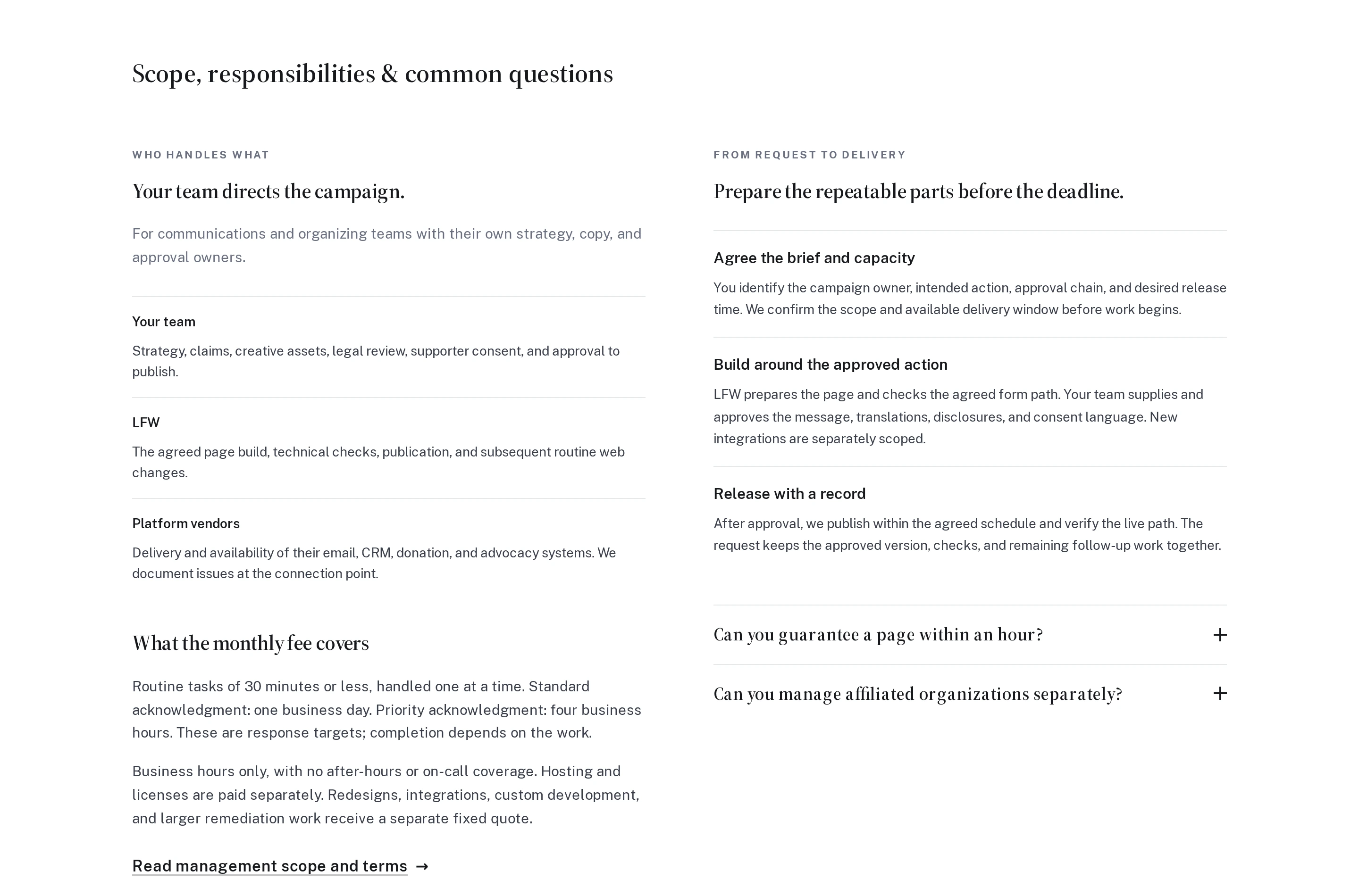
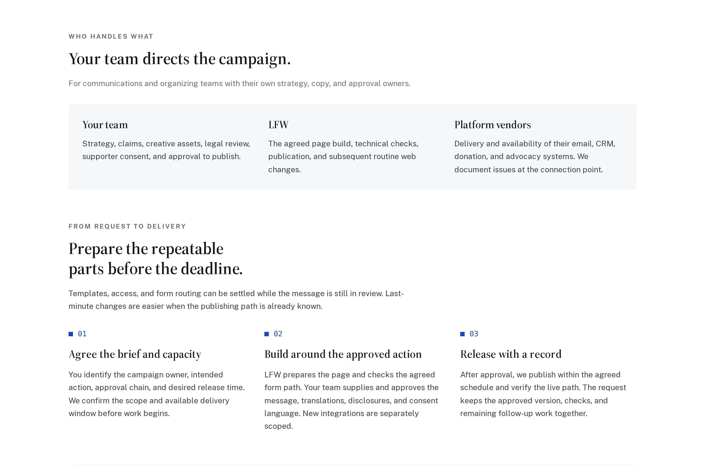
Our audience pages now move through responsibilities, delivery, fees, and questions in a clear sequence. Related items sit together, instead of unrelated sections competing in uneven columns.
On phones, the same sequence reads straight down the page. Paragraphs keep a comfortable width, and the shared improvement carries through the English, Spanish, and French pages.
The opening responsibilities and delivery sections on the advocacy page, at the same desktop size. The before image is from the live original; the after image is from the updated source preview. In the new layout, fees and FAQs follow below the cropped view.
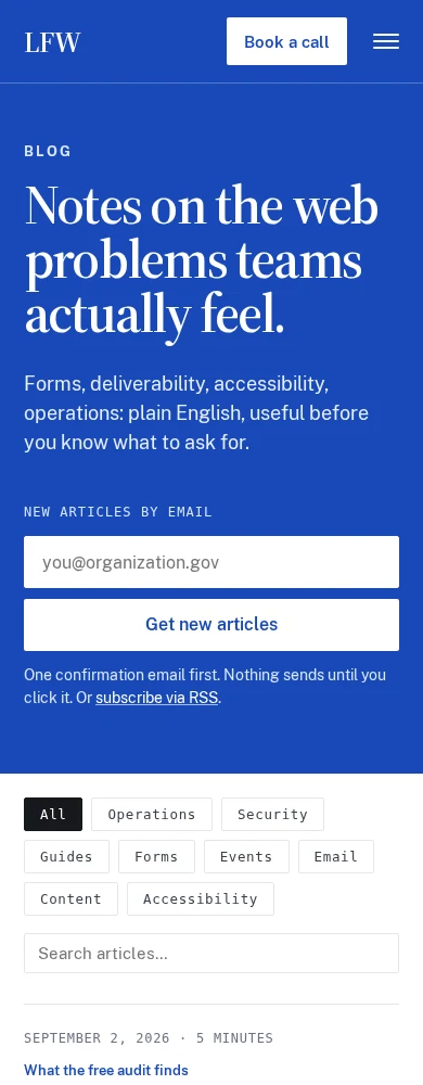
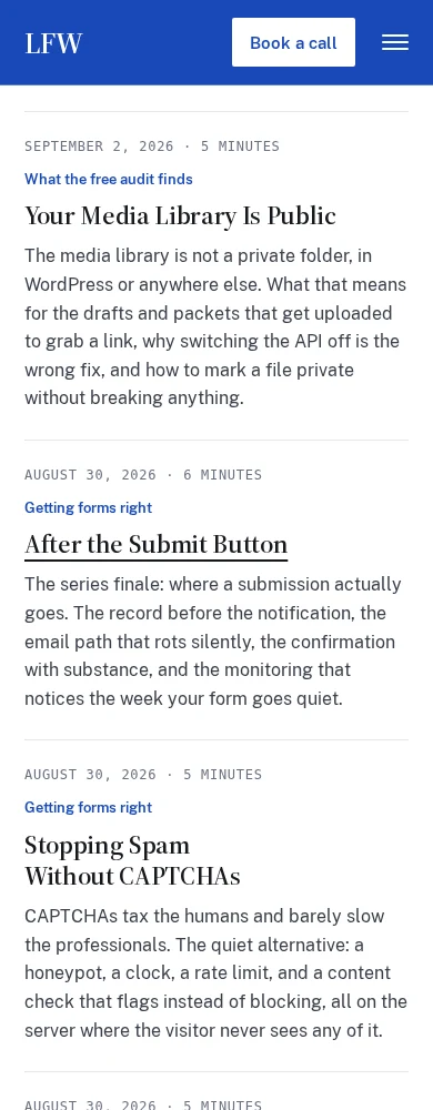
Page numbers and previous or next links now load the next set of blog posts in place, then bring the first new article into view below the header. No trip back through the introduction.
The address updates as you browse, and Back and Forward take you through the archive. Search and topic choices carry forward without resetting the forms on the page.
The same improvement works in English, Spanish, and French. Ordinary page links remain available for direct visits, new tabs, and browsers without JavaScript.
The same action on a phone: open the blog and choose page 2. The original live page returns to the introduction; the updated source preview lands at the new articles. Both are actual browser captures with identical article content.
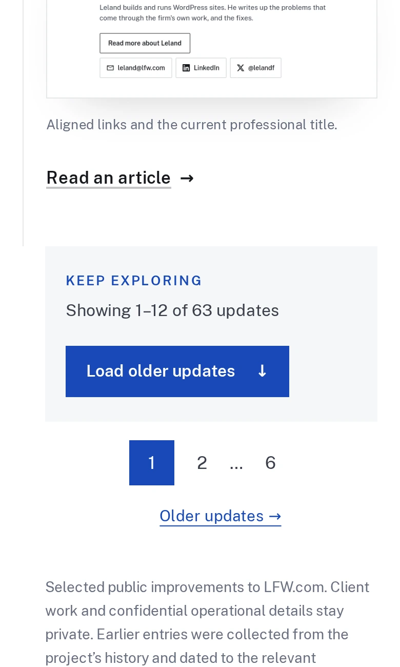
The changelog now opens with twelve updates. Load another batch when you want to keep reading, or use the page links to move through the archive.
Older entries are fetched on request instead of being included in the opening page. Month and category links still cover the complete history, and shared updates have their own permanent pages.
Before-and-after screenshots and enlarged previews continue to work in newly loaded updates. Ordinary page links also work without JavaScript.
The same 63-update archive before these announcements were added: the live original page and an isolated preview of the new pagination. Both show the end of the same twelfth update on a phone.
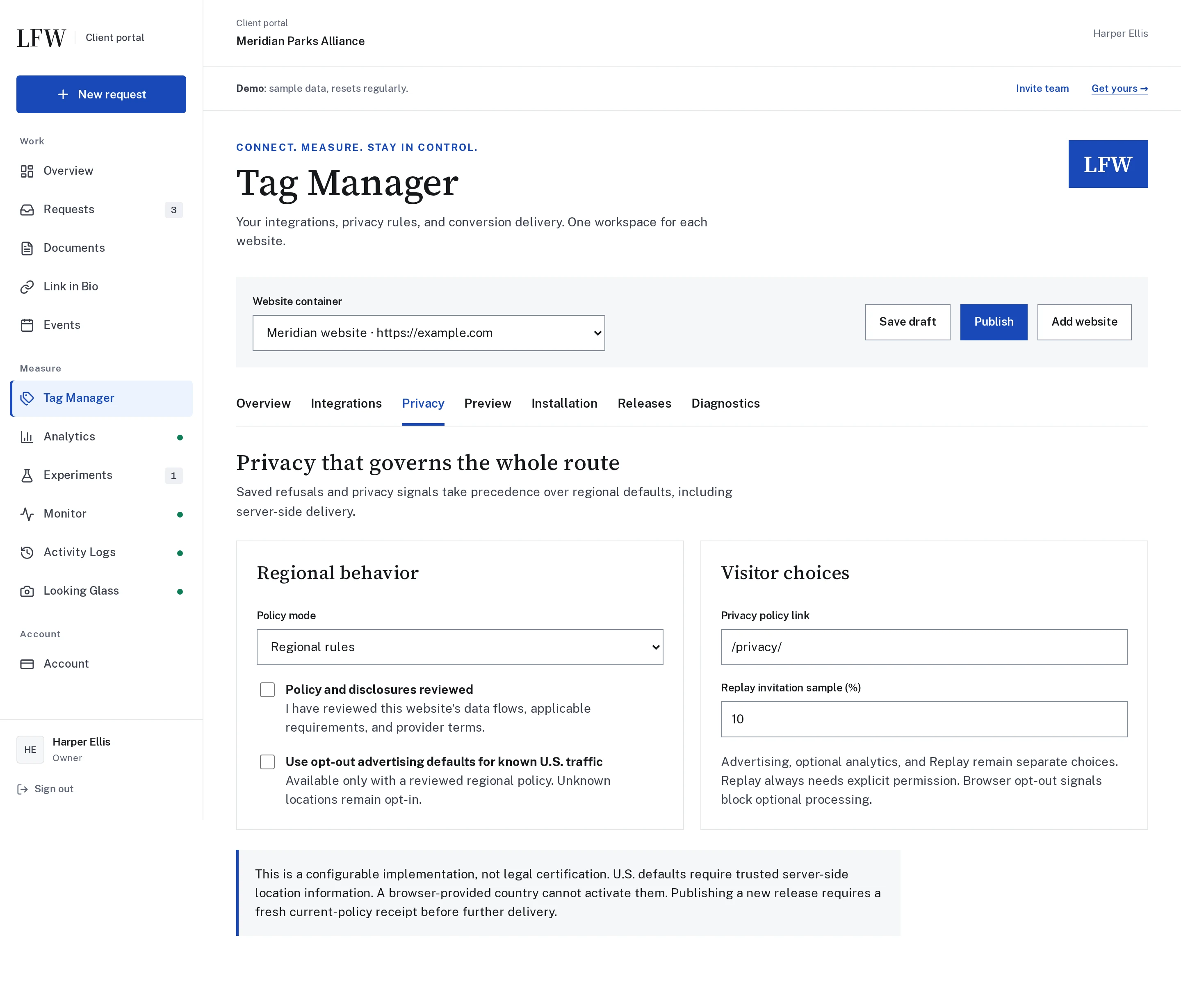
Explore Tag Manager through real phone and desktop views of the Client Portal and WordPress connection. On a phone, the previews now show the mobile interface first.
Switch between Phone and Desktop or enlarge a screenshot to inspect the full view. Short previews no longer leave a tall empty space below the image.
We tried a translucent header. Leland preferred the solid blue, especially over blue sections, so we brought it back.
The header still follows you as you scroll. Only the background treatment has changed.
The matched previews from our original header experiment, shown in reverse to illustrate the return to solid blue. These are the earlier style comparisons, not new page captures.
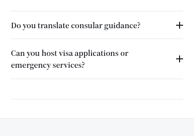
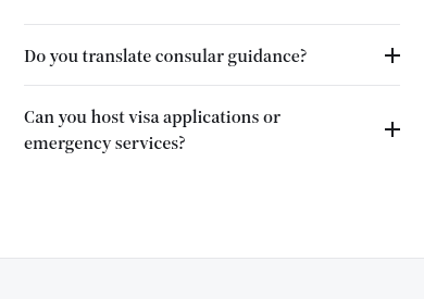
Removed redundant closing lines beneath the questions on our audience pages and in the brand color guide. Dividers still separate questions and sections, without extra rules across empty space.
The shared audience-page improvement also applies to the Spanish and French versions. The questions, answers, and expandable details are unchanged.
The embassies page captured on a phone-sized viewport, then the same view with the exact updated styles applied in a browser preview before deployment.
You can now follow the improvements we make to LFW.com in one place. Browse by category, share an individual update, or subscribe through your feed reader.
We’ll publish selected changes with enough context to explain what improved and why. It’s a way to see ongoing website care in practice and find ideas for your own site.
Browse the dated history back to August 10 using the month links or the shortcut to our first update. Visual updates include real screenshots, with before-and-after comparisons where they help explain the change.
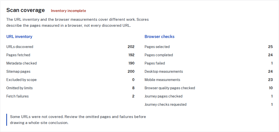
Monitor now separates its public-page inventory from its desktop and mobile browser sample. Review indexing conflicts, page metadata, redirects, and the evidence behind a finding, with clear counts for checked, skipped, and unavailable pages.
Record intentional exceptions and add read-only checks for important page journeys. Browser checks can flag layout overflow, failed resources, and script errors without submitting a form or sending a message.
The Client Portal shows scan coverage alongside the findings selected for the client. A score describes the measured sample, not a promise that every page or interaction is perfect.
The Monitor guide explains the expanded checks, what needs configuration, and what automated testing cannot confirm. Start with a free audit or request a quote for ongoing monitoring.
Selected public improvements to LFW.com. Client work and confidential operational details
stay private. Earlier entries were collected from the project’s history and dated to the
relevant milestones. Screenshots labeled “current” show the version captured for this
changelog, not necessarily the version on the entry’s date.
What could we improve on your site?
Bring the website you have and the things you’d like to change. We’ll talk through the
priorities and prepare a quote for your organization.