One topic at a time.
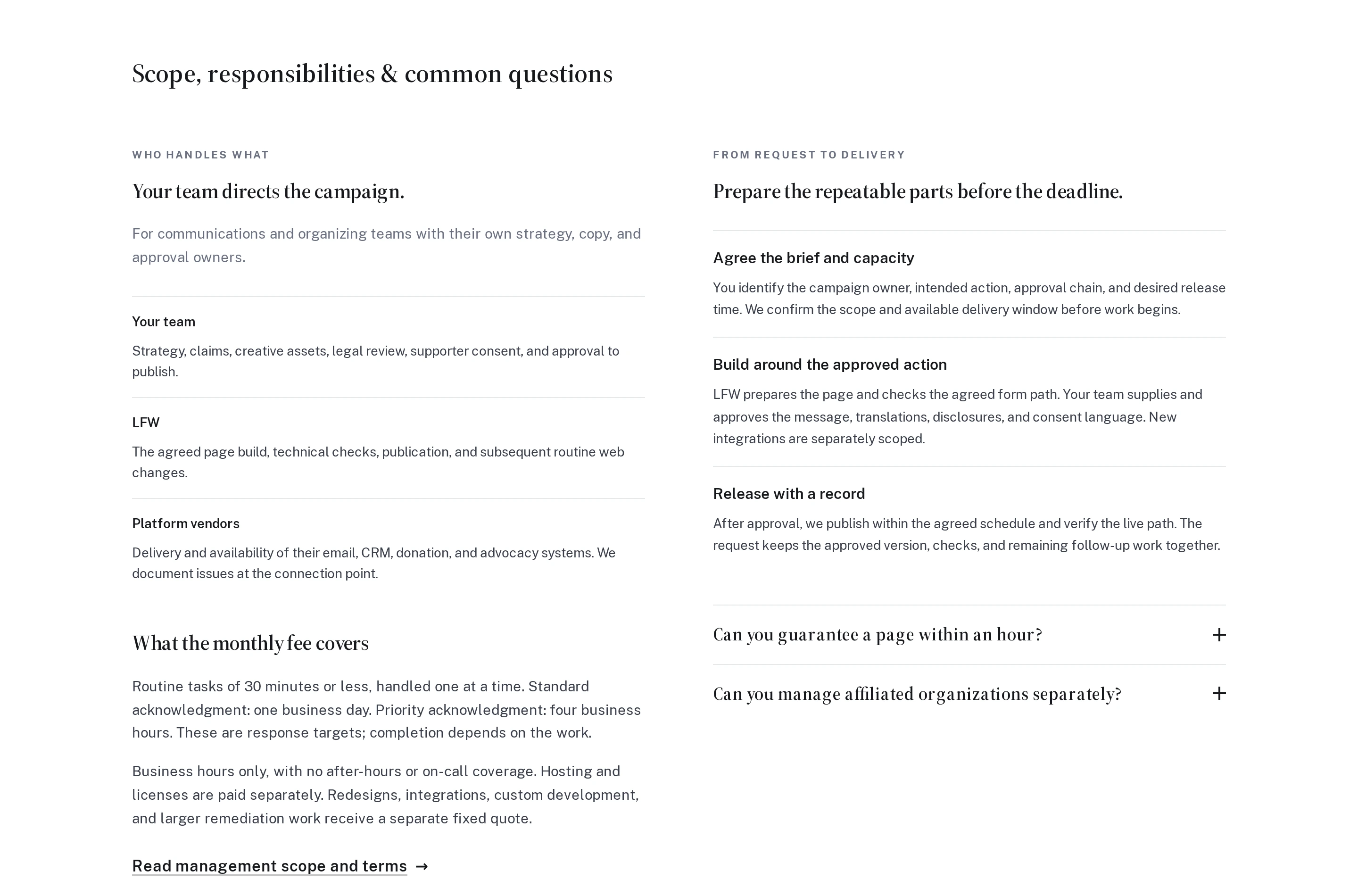
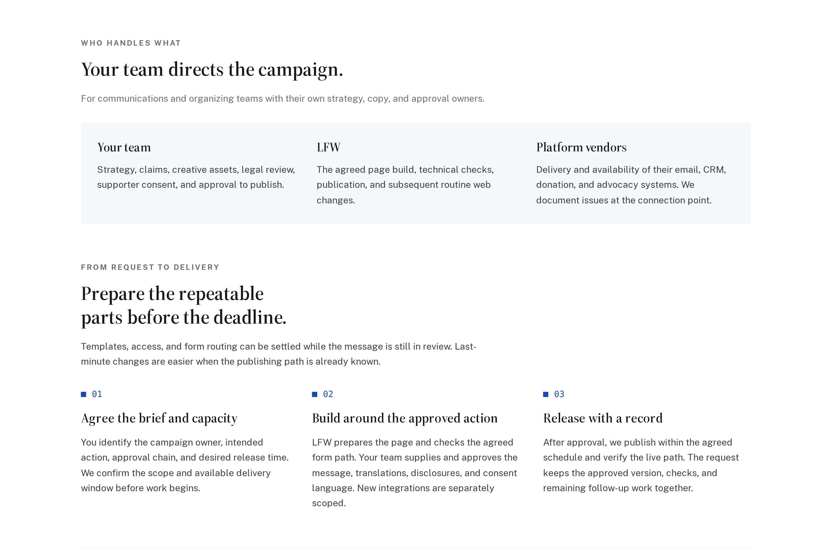
Our audience pages now move through responsibilities, delivery, fees, and questions in a clear sequence. Related items sit together, instead of unrelated sections competing in uneven columns.
On phones, the same sequence reads straight down the page. Paragraphs keep a comfortable width, and the shared improvement carries through the English, Spanish, and French pages.
The opening responsibilities and delivery sections on the advocacy page, at the same desktop size. The before image is from the live original; the after image is from the updated source preview. In the new layout, fees and FAQs follow below the cropped view.
Enlarge to view the full screenshot.
Enlarge to view the full screenshot.